6 👀 Visualizing One-Variable Data
You can find more examples of charts and graphics at R Charts
Now that we have talked about summarizing data, let’s talk about visualizing it.
6.1 Histograms
You can use the built-in hist() function in order to create histograms, very easily. Below, I will graph the TAVG, average temperature, from the dca_weather dataset in February, when month equals 2.
feb_temps<- dca_weather$TAVG[dca_weather$month %in% 2]
hist(feb_temps,
     col= "skyblue",
     main= "Average Daily Temperature at DCA in February 2022",
     xlab= "Temperature (Fahrenheit)",
     ylab="Number of Days")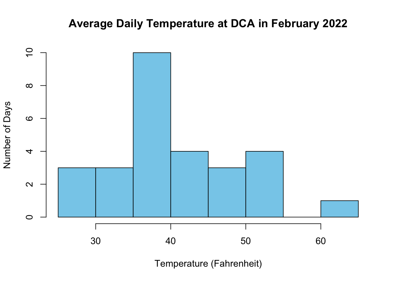
When we use any plotting function in R, we always pass some extra commands to customize the chart called a parameter.
You can type all the parameters in a single line, but it is usually cleaner to make a new line for each parameter. As long as you follow each parameter with a comma , and the parameters are all inside the parentheses () of your plot command, you will be OK.
6.1.1 Graphical Parameters
Here’s a breakdown of the parameters in the histogram above:
-
col: Sets the color of the graphic elements. Here’s a list of colors that you can pick from in R -
main: Sets the main title of the graph. -
xlab: Sets the x-axis label. Always include units! -
ylab: Sets the y-axis label. Always include context!
6.2 Histogram Exercise
Your turn! In the box below is a histogram of march_temps at DCA. Label the graph appropriately, and change the color to darkseagreen4.
6.3 Dotplots
Unfortunately, there’s no built in function to create dotplots in R. We have to repurpose the stripchart command in order to make something closest to a dotplot.
First, I will store TAVG, average temperature, from the dca_weather dataset in June, when month equals 6. I will save this data into a variable called june_temps.
june_temps<- dca_weather$TAVG[dca_weather$month %in% 6]Here’s the code for creating a dotplot. Notice that june_temps is actually a vector (a list of many numbers).
stripchart(june_temps, method = "stack",
           offset = .5,
           at = 0,
           pch = 19,
           col = "steelblue",
           main = "Average June Temperatures at DCA",
           xlab = "Temperature (Fahrenheit)")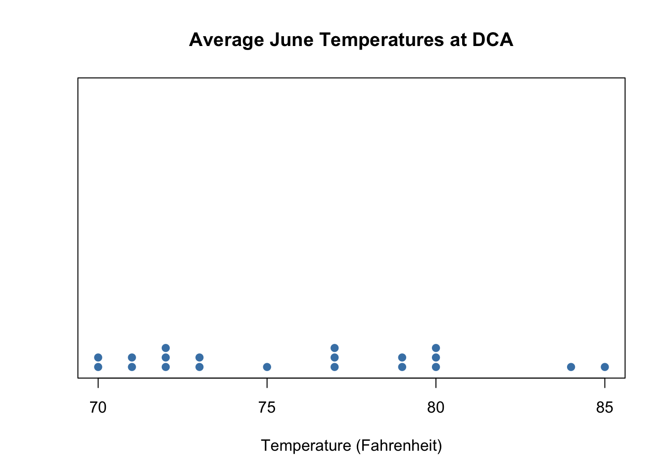
As before, you pass several parameters into stripchart(). You can safely ignore stack=, offset=, and at=. Just include them, any time you need a dotplot.
pch= is a parameter that you can feel free to modify. It specifies the style of each dot. For a list of different dot styles you can use, click here.
6.4 Boxplots
6.4.1 Single Boxplots
Let’s start off with the most simple case: making one boxplot with one variable. I’ll make a boxplot of June Temperatures in DCA:
boxplot(june_temps,
        col="pink",
        main= "Boxplot of June Temperatures at DCA Airport",
        xlab= "Temperature (Fahrenheit)",
        horizontal= TRUE)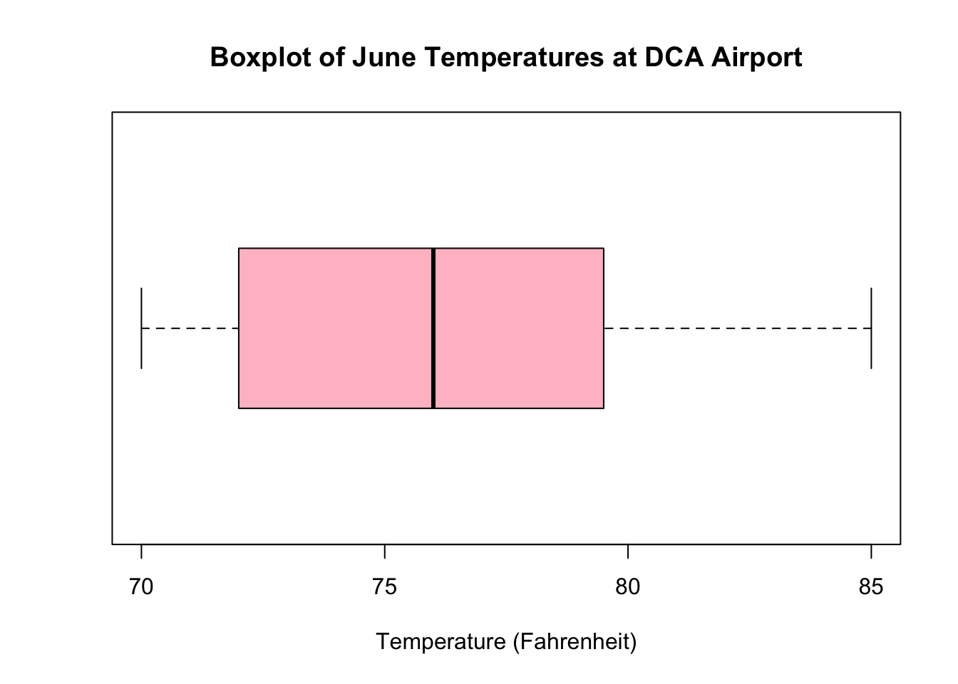
By default, the boxplot() command will create boxplots in the vertical orientation (more on this later). If you want to have the boxplots become horizontal, set the horizontal= parameter to TRUE.
6.4.2 Grouped Boxplots
Normally, you don’t just make one boxplot, but several boxplots to compare variance within groups. To do this, we have to give the boxplot() command a second grouping variable, which we indicate with the ~ operator.
Usually, both the variable you want to graph and the variable you want to group by are in the same dataset, so we specify it with the data= parameter. Below are the bosplots for TAVG with the dca_weather dataset, grouped by month.
boxplot(TAVG~month, data=dca_weather,
        col="skyblue",
        main= "Daily Average Temperatures at DCA Airport, by Month",
        xlab= "Month",
        ylab="Temperature (Fahrenheit)")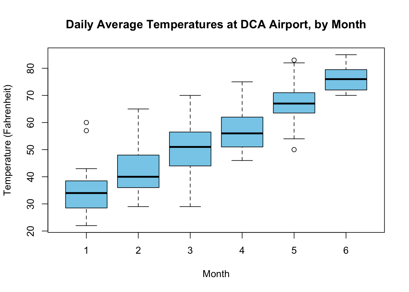
The ~ variable effectively tells R which axis to to place each variable in, based on y~x. In other words, since the first variable is TAVG, that goes on the y-axis, and month goes on the x-axis. We have effectively set month as our grouping variable.
Look at what happens when you switch the axes around:
boxplot(month~TAVG, data=dca_weather)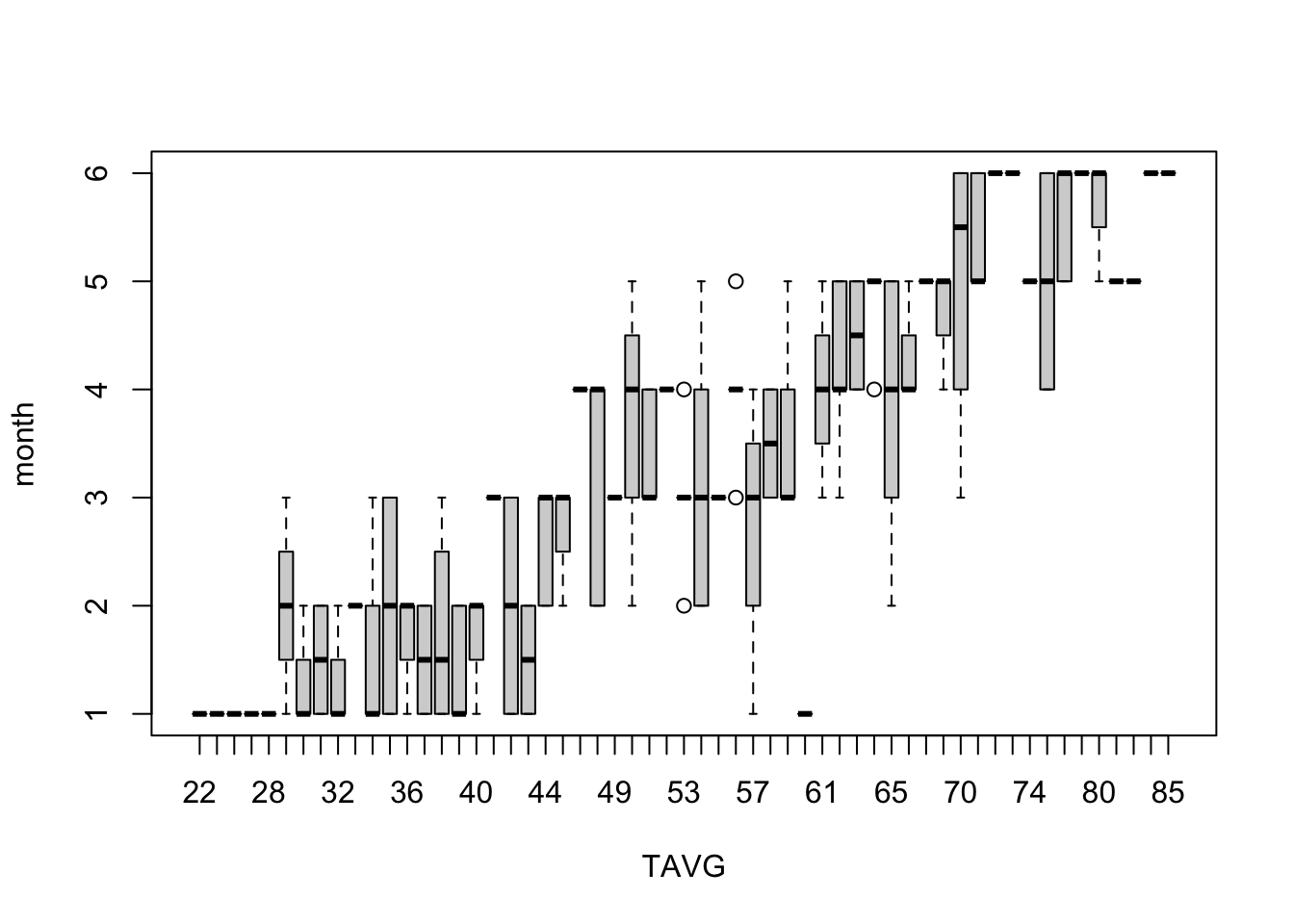
Yep. It’s not pretty. Be careful of which variable goes where.
6.4.3 Customizing boxplot()
Here’s an idea of the things you can do with boxplots:
boxplot(TAVG~month, data=dca_weather,
        col=c("skyblue", "darkcyan", "cadetblue1", "chartreuse", "forestgreen", "darkorange"),
        main= "Daily Average Temperatures at DCA Airport, by Month",
        xlab= "Month",
        ylab="Temperature (Fahrenheit)",
        names=c("Jan", "Feb", "Mar", "Apr", "May", "Jun"))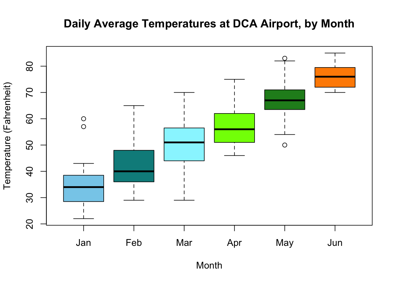
- In our original graph,
Monthswere labeled as their numbers. If you want to give custom names for each group, use thenames=parameter. Remember to set thenames=parameter to a vector equal to the number of boxplots there are, otherwise, R will return an error. - If you want to give your boxplots different colors, set
col=to a character vector of color names. Remember the length of this vector also needs to be equal to the number of boxplots. - R automatically calculates what the appropriate x and y axes values are. If you want to change them, specify an
xlim=andylim=parameter. Each parameter should take the form ofc(min, max), where min and max are the numeric values for the start of the axis and the end of the axis, respectively.
6.5 Boxplot Exercise
Your turn! The following boxplot was supposed to graph the PRCP variable (representing amount of snow/rainfall in inches), grouped by month, but is completely messed up. Fix it so that:
- You graph
PRCP, grouped bymonth - You have an appropriate main title, x-axis, and y-axis labels
- The “Months” are labeled as “Jan”, “Feb”, “Mar”, etc. etc.
- You add some pretty colors to your boxplots.
- You have a y-axis that goes from 0 to 100.
6.6 Exporting your graphs
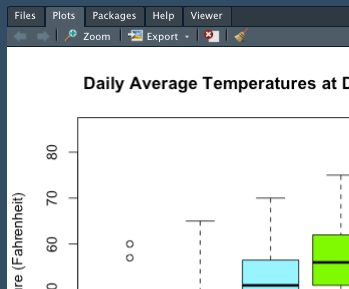
You can find your plots under the Plots tab in the lower right.
There are a couple of ways to export your graphs in RStudio.
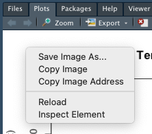
- Right click on the plot, and select “Save Image As”, or “Copy to Clipboard”.
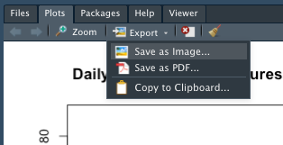
- Click on Export on the top, and then click “Save As Image”, or “Copy to Clipboard”.
6.6.1 Blurry Graphs?
Blurry graphs happen because your plot window is too small. For some reason, it hapens more on the FCPS provided computers than on personal laptops. To fix:
- Under the plots tab, click “Zoom”. A new window will pop open.
- This window will have a larger version of your graph. Use the right click method to save your graph.
6.7 More graphing options
6.7.1 Using par()
If you run par() before the command for any graph, you can stack multiple graphs into the same window. Here’s an example:
Switch the 1 and 2 around in the mfrow= parameter so it says par(mfrow=c(2,1)). Then, rerun the code. What happens?
As you can see, passing the mfrow= parameter allows you to stack multiple graphs based on the a certain number of rows and columns. This will be helpful, especially when you have multiple graphs of the same variable.
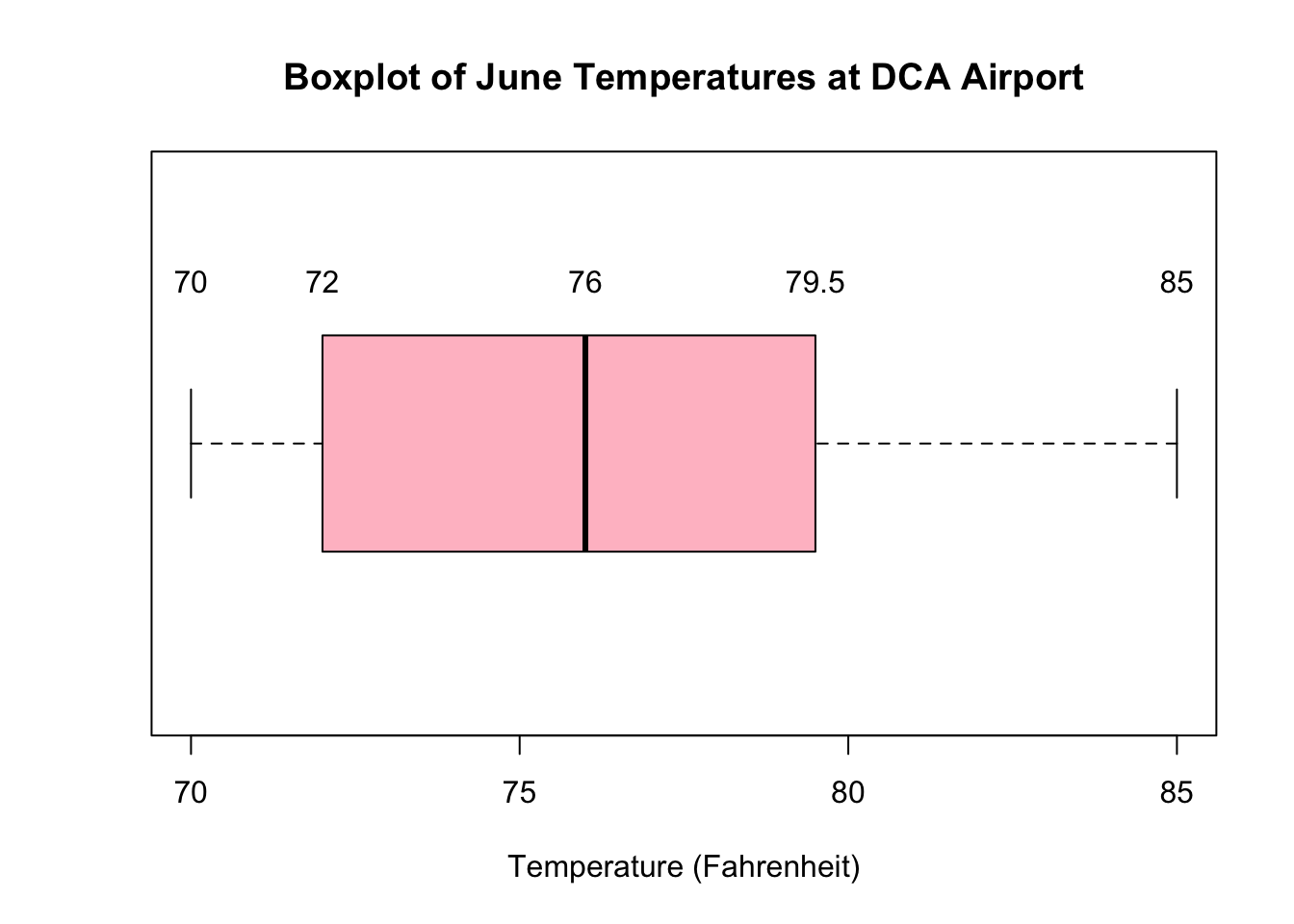
6.7.2 Overlaying a five number summary onto a boxplot
Every graph in R can be thought of as a layer– if you want to add anything on top of your graph, it is represented as a subsequent call after your plot command.
For example, if I wanted to overlay a five number summary on top of each part of the boxplot, I run the text() command. Inside the text command, I tell R what labels= to place, and at which x= value they should be placed at.
boxplot(june_temps,
        col="pink",
        main= "Boxplot of June Temperatures at DCA Airport",
        xlab= "Temperature (Fahrenheit)",
        horizontal= TRUE)
text(labels=fivenum(june_temps), x=fivenum(june_temps),  y=1.3)